
Menu
Client: City of Los Angeles
Developer: Tranzito-Vector
Architecture: Skidmore, Owings & Merrill (SOM)
UI/UX: Designworks, A BMW Group Company
Urban Design: Studio One Eleven
Fabrication: Tolar Manufacturing
Lighting Design: HLB Lighting
Reference resources:
World Changing IdeaS - Fastcompany
Case Study - BMW DesignWorks
11.2022 - 11.2023
Product Manager, Creative Director, UX Design Lead, 3 Interaction Designers, 2 Industrial Designers
1. Develop end to end multi-platform design solutions from offline public display to online Web App.
2. Conduct usability testing and meet WCAG standards.
3. Design new branding identity & visual language.
4. Develop key features for content management system.
5. Hand off design documents/specs to eng team.
6. Establish cohesive design system & component library for all products.
7. Closely collaborated with the internal team, and partners.
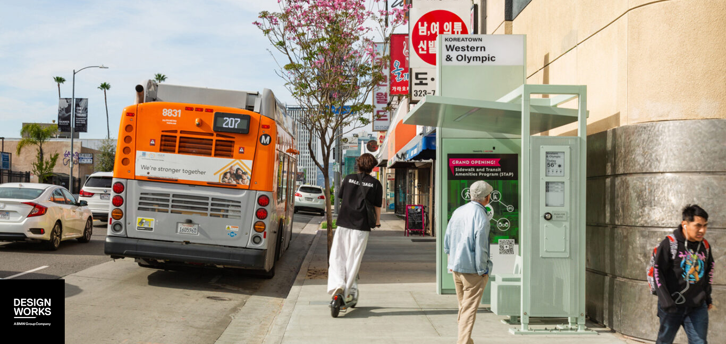
The City of Los Angeles announced plans to enhance bus shelter structures with improved design and amenities to better serve Angelenos. These also intended to prepare upcoming big events including 2026 World Cup & 2028 LA Olympic Games.

Los Angeles County is the #1 most populous county in the US but public transportation is really outdated and unfriendly.

General Communters Impact:
Enhances commuters’ safety, comfort, and convenience through real-time digital transit information, shade, and connected design.
Clients/Business Impact:
Enhances city identity and introduces new monetization models through digital platforms and design innovation.

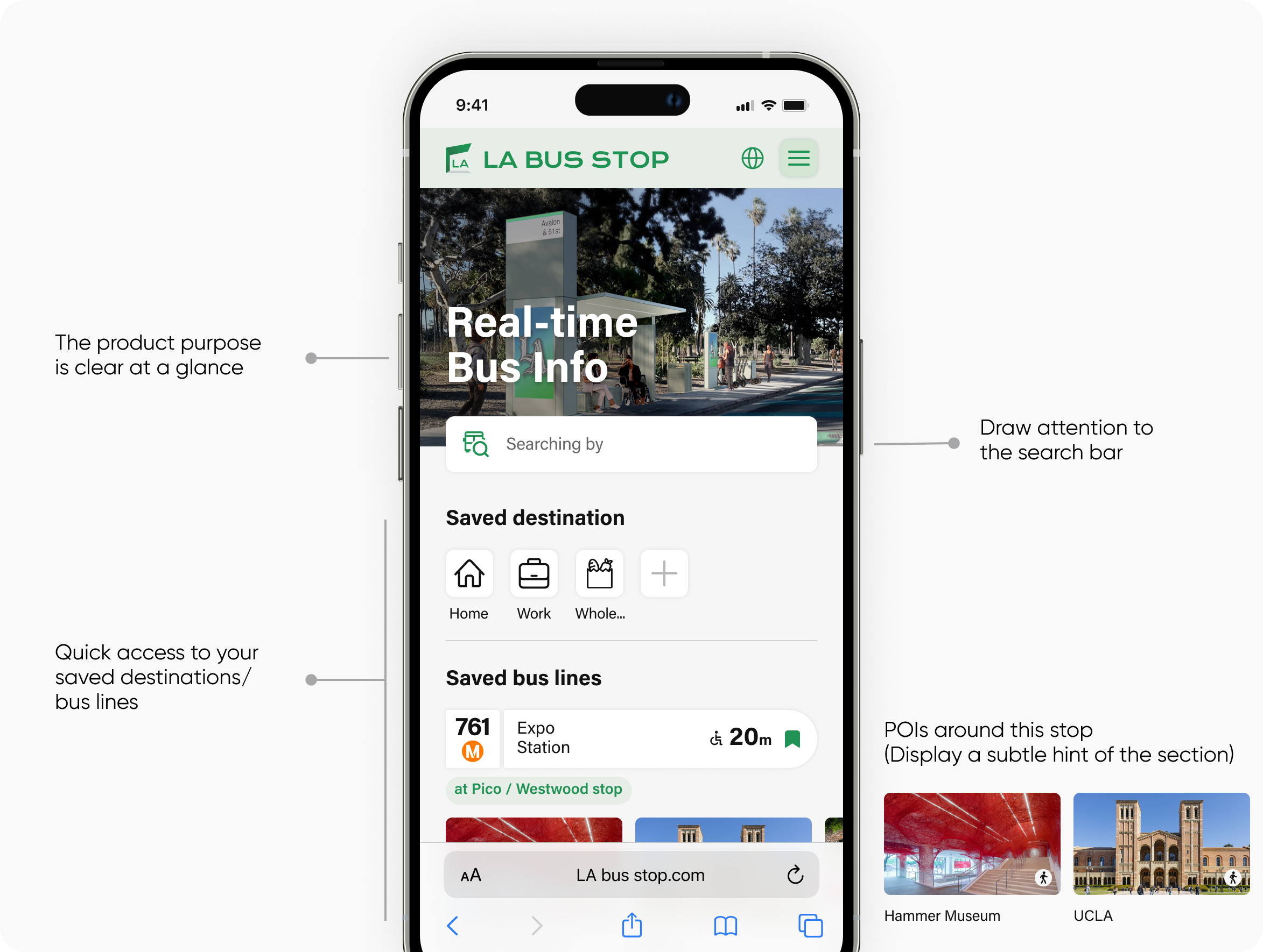
Based on extensive research on LA riders, I've found that physical shelter displays alone can't meet everyone's needs. The Companion Web app supports physical shelters, aiding people in LA without cars.

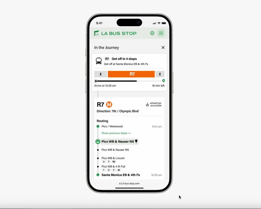
Open the web app to instantly see accurate bus status and next departure time. Bookmark buses or destination that go frequently to track and easily access on the home page for future.

Seamlessly integrated routing with exploration functionality. This feature ensures a stress-free bus-taking experience while empowering users to discover nearby points of interest, transforming wait times into exciting adventures.

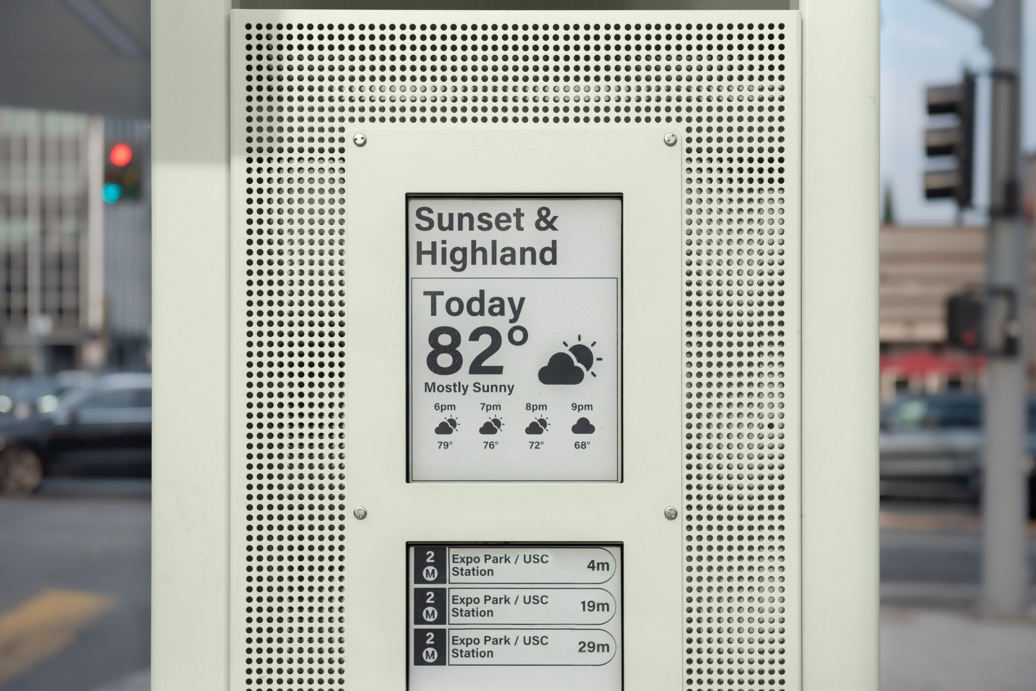
Provide inclusive real-time bus information including arrival, delay, route updates and emergency alerts for all riders at each bus stop.


Allowing staffs to efficiently control and manage all assets and data in one central location.

Crafted a visual identity that embodies the Los Angeles's vibrant people and culture.
Since the public transit experience is a broad and complex topic, I began by gaining a contextual understanding through three main questions:

Research domestic & global best practices + Get inspiration of future transportation concept

Experience the LA bus journey from a rider's perspective

Collaborated with PMs and clients to interview with local riders & collect over 50+ on-site surveys

Pain Point #1
Los Angeles bus signage lacks clear and intuitive messaging, leading to extra time and effort for understanding. Multiple bus systems with different branding and signage further complicate the issue.
.png)
Pain Point #2
Tourists and infrequent riders often stress over getting off at the wrong stop due to unfamiliarity with the LA bus system and unintuitive guidance.

Pain Point #3
Research indicates that the first/last mile challenge significantly deters bus ridership. Overlooked amenities could address this issue effectively. Additionally, many riders struggle with navigating multiple apps to plan and explore their bus journeys in the city.

Pain Point #4
About 80% of bus stops lack a push-to-talk feature, and existing ones often vary in functionality and button height, making them inaccessible to wheelchair users. The design also lacks universality, posing challenges for foreigners to understand.


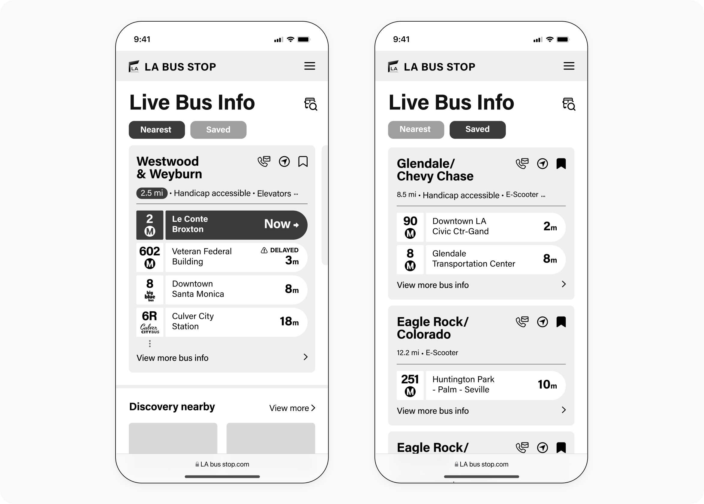


Open the web app to instantly see accurate bus status and next departure time. Bookmark buses or destination that go frequently to track and easily access on the home page for future.
Seamlessly integrated routing with exploration functionality. This feature ensures a stress-free bus-taking experience while empowering users to discover nearby points of interest, transforming wait times into exciting adventures.

- Trip planing
- Navigating to bus stop
- Discover POIs around the bus stop


- Journey Timeline & Companion
- Highlights interesting stops & POIs along the way

- Amenities available near the bus stop
- Saved this bus line or destination for future easy access


.png)
Ensuring everyone, including people with disabilities, can access and benefit from the information, complying with legal standards and enhancing usability.

By using this checklist, it help me systematically address and be aware of those key aspects

I conducted several rounds of testing on the actual display to validate and refine the design, ensuring it meets ADA requirements and is accessible to all.


By default, the top screen displays local weather and city news in a very clean and simply layout, but when a bus is arriving, it takes over the top screen, which it will taking more attention and from the testing we confirm rider who are from a 15 inch distance could also seen the arriving info very clearly


Enhance the waiting experience with dynamic lighting and sound, keeping commuters informed and relaxed while improving accessibility for those with disabilities.

A visible emergency button ensures quick help, while a push-to-talk button is wheelchair-accessible and designed for the visually impaired.


In complex projects involving multiple external partners, such as STAP, blending digital and physical elements, staying on the same page is absolutely key. Regular updates, confirmed information, and get timely client feedback will large help prevent redundant tasks. While surprises can still occur, But they serve as valuable takeaway.
When we're creating stuff like bus shelters for everyone to use, prioritizing inclusivity and accessibility is paramount. These amenities serve a diverse range of people, making it crucial to address various needs. It’s important that we Conduct thorough research and field studies to uncover pain points and observe user behavior. In the meanwhile, keep testing in different situations to catch problems early. It's all about making sure our designs work for everyone

My experience with DesignWorks was a journey marked by continuous learning, valuable connections, and a spirit of bold creativity. Amidst a team of supportive and kind-hearted colleagues, I embraced the opportunity to explore new domains, pushing the boundaries of my capabilities.